Green River Canoes
Our travel company which provides Inn-to-Inn Guided Canoe Trips to the south of France, the Belgium Ardennes and the Garden of England has had a web-site makeover,Although I was happy with the original site and the way it looked I had the feeling over the past year that some people were finding the site difficult to navigate. To find out everything for a trip you had to visit several pages. On the new site you can find out everything you need to know from one page: that is the Trip description, its scheduled dates & prices, the day-to-day itinerary and the details of the hotels we use as well as photographs and maps.
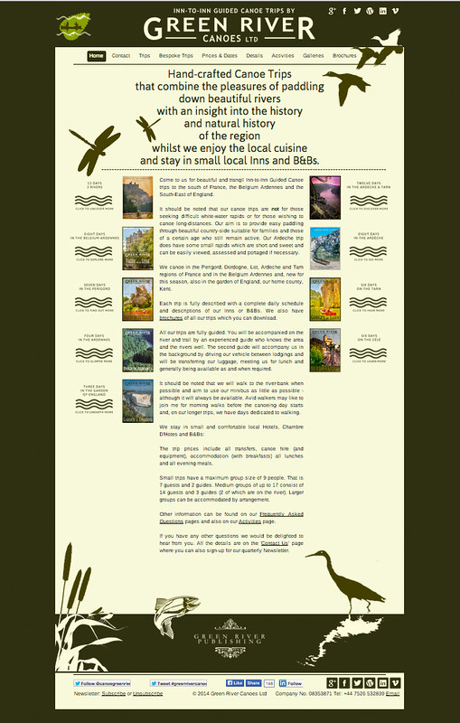
Design-wise I've gone for a simple bi-colour scheme based on the Pullman colours of Umber (Dark Brown) & Cream with a 3rd highlight colour a shade of Green. It terms of graphics I've opted for a simple silhouette style which echoes something of the Penguin paperback design ethos of the 1950s.
I was aiming for something that looked reassuring & comfortable and without the common 'in your face' promotional feel of many similar sites. I took some inspiration from the Rapha Travel site as well.
Although the site makes use of photographs from the trips - slide-shows are available for each trip - I've made extensive use of the 'posters' I made earlier in the year and these are used as menus to the trip pages from the front page.
Here is a screen shot of the opening page:


No comments:
Post a Comment